
Nuxt-first SSR
Writes data-theme, data-theme-mode, color-scheme, and icon CSS variables before Vue mounts.
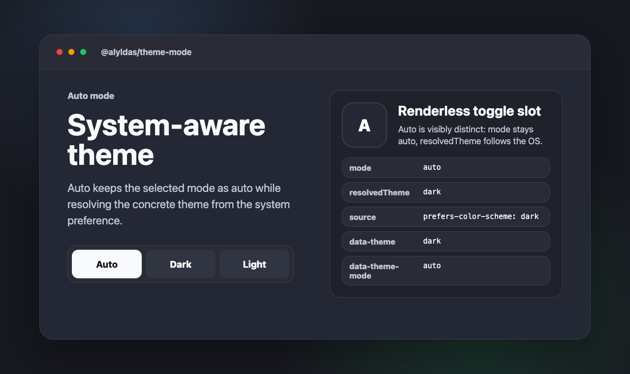
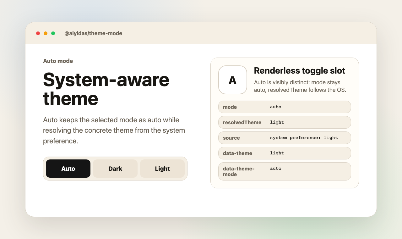
A Nuxt color mode module, Vue toggle primitives, and framework-neutral helpers that keep selected mode and resolved theme separate.
One flow: register GitHub Packages, install the package, then import only the entry point your app actually uses.
Add the GitHub Packages registry to .npmrc:
@alyldas:registry=https://npm.pkg.github.comPackage reads can require a token with
read:packages.
Install the package:
npm install @alyldas/theme-modeImport the CSS and your entry point:
import '@alyldas/theme-mode/style.css'
import '@alyldas/theme-mode/nuxt'Replace the entry-point import above with one of these lines:
@alyldas/theme-mode/nuxtBest for Nuxt apps that need theme state before hydration.
Adds the SSR-safe bootstrap path and keeps runtime options aligned.
import '@alyldas/theme-mode/nuxt'@alyldas/theme-mode/vueBest for app shells, custom buttons, widgets, and tests.
Use the shared controller or the renderless toggle slot in your own UI.
import '@alyldas/theme-mode/vue'@alyldas/theme-mode/coreBest for adapters that only need parsing, persistence, and DOM writes.
Use it from plain TypeScript when no Vue runtime is involved.
import '@alyldas/theme-mode/core'Start with the module only. Add options when you need custom storage keys, attributes, or CSS variable prefixes.
export default defineNuxtConfig({
  modules: ['@alyldas/theme-mode/nuxt'],
})export default defineNuxtConfig({
modules: ['@alyldas/theme-mode/nuxt'],
themeMode: {
// Before Vue mounts
defaultMode: 'auto',
fallbackTheme: 'dark', // color-scheme: native controls
attribute: 'data-theme', // data-theme: light | dark
modeAttribute: 'data-theme-mode', // data-theme-mode: auto | dark | light
cssVariablePrefix: 'theme-mode', // --theme-mode-*: toggle state
storageKey: 'theme',
},
})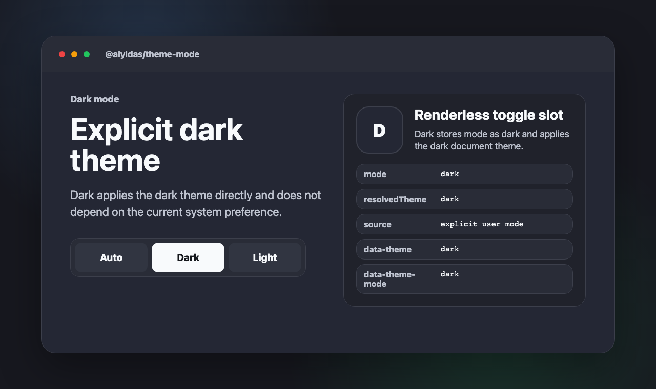
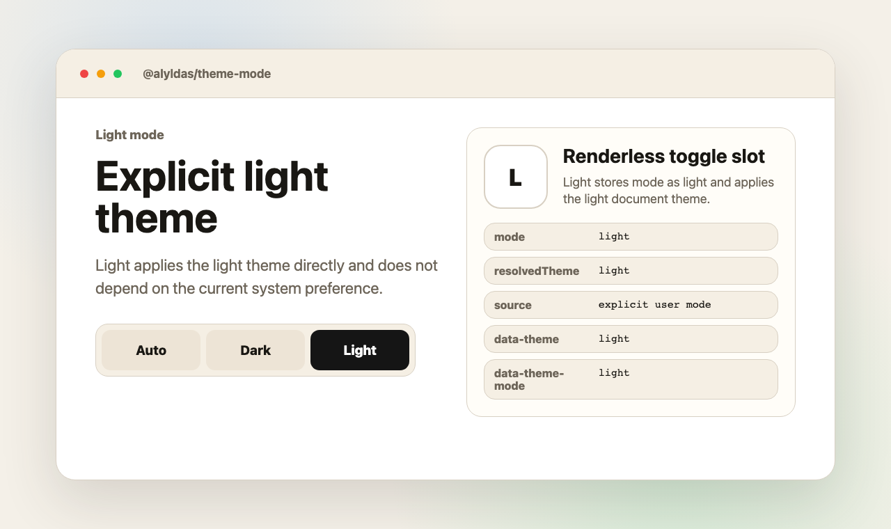
The preview images above are generated from the standalone example committed in the repository.